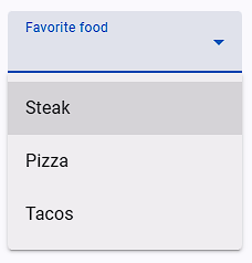
Material Single Select
This field type is designed for handling dropdown elements in web applications, particularly focusing on search and selection functionalities. The options provided allow for fine-tuning the behavior of the dropdown interaction, ensuring accurate and efficient selection of options.

Options
| Options | Description |
|---|---|
| Match options as | How the field value should be matched with the dropdown options. |
| External Library Name | If you know that an external library is used in the dropdown then select that library. If the library name is not there then select Other Material Library option. |
| Want until max options in the dropdown element | Wait until the maximum number of options are available in the dropdown before proceeding. |
| Convert the text into lowercase letters and then match the text | Convert the text to lowercase before matching it with the dropdown options. |
| Remove extra space from option text then match the text | Remove any extra spaces from the option text before matching. |
| Remove all space from option text then match the text | Remove all spaces from the option text before matching. |
| Waiting time after dropdown is open | Sets the waiting time (in milliseconds) after the dropdown is opened before any action is taken. |
| If this field is to select text after the search | Indicates whether the field is used to select text after performing a search within the dropdown. |
| Before selecting the dropdown option, check that option is already selected? | Specifies whether the field should check if the option is already selected before attempting to select it again. |
| Before selecting the dropdown option, uncheck the already selected options | Determines whether the field should uncheck any already selected options before selecting the new one. |
| Trigger event on dropdown matched option | Specifies whether an event should be triggered when the matched option is found in the dropdown. |
Match options as
This option gives the matching options available to select text based on various criteria.
| Options | Description | Example |
|---|---|---|
| Equal to Name | Select an option that exactly matches the provided field value. | Select the option only if it matches the field value exactly. |
| Search Name in Any Position | Search for the provided field value at any position within the option text. | Select the option if the field value appears anywhere in the option text. |
| Match Name from Start-End Position | Field value to match the option text entirely, from start to end. | Select the option only if the field value matches the entire option text from start to end. |
External Library Name
Specifies the name of the external library used for handling dropdown interactions. If the library name is not there then select Other Material Library option.
Other Material Library
If you select the Other Material Library option, you'll need to define the following values, with Dropdown Options List Query being essential:
| Options | Description |
|---|---|
| Dropdown Options List Query | Specifies the query selector for the elements that represent the selection options within the dropdown. |
| Dropdown Open Element Query | Defines the query selector for the element that triggers the opening of the dropdown. |
| Dropdown Close Element Query | Specifies the query selector for the element that triggers the closing of the dropdown. |
| Selected Value Element Query | Specifies the query selector for the element that displays the currently selected value. |
Other Material Libraries
MUI Autocomplete
Dropdown options list selector query is ul > li.MuiAutocomplete-option for MUI Autocomplete.
MUI Select
- How to open MUI Select dropdown options.js
let event = new MouseEvent("mousedown", { view: window, bubbles: true, cancelable: true, }); document.querySelector("input").parentNode.querySelector("div").dispatchEvent(event); - Dropdown options list selector query is
ul.MuiMenu-list > li[role="option"]js// For choice dropdown option document.querySelector("div.MuiSelect-select").dispatchEvent(new MouseEvent("mousedown", { bubbles: true })); - Close already opened options selector query
div.MuiModal-root[role='presentation'] > div
React Select
Dropdown options list selector query is div[class*='-menu'] div[class*='-option'] for React Select.
- Use field javascript event
['mousedown', 'click', 'mouseup']for open dropdown options and this is selector querydiv[class*='-indicatorContainer']
Chosen Dropdown
Use field javascript mouse event ['mouseup'] for Chosen Dropdown.
NOTE
If you are using a kendo-ui dropdown, do not use the field's javascript event option.